New logo and visual identity for the Benelux Chamber of Commerce in China
The Benelux Chamber of Commerce in China is very happy to announce the adoption of a new logo & visual identity that better fits its vision, mission and value which is to provide relevant, unique, qualitative and valuable connections, content and communities, based on our research, network and experience, as well as that of our members. We welcome Chinese companies and executives in our community to foster cooperation and build a joint network benefitting both Chinese and Benelux companies across our four countries.
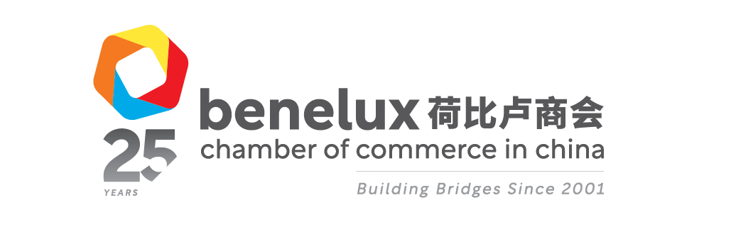
The new Benelux Chamber logo represents the connections to succeed. Its rounded inner square represents the four countries: Belgium, the Netherlands, Luxembourg and China. The outer corners symbolize the different directions business may take you from, to and in China.
Distinct and recognisable national colours represent the roots of our nations. Yellow for Belgium, orange for the Netherlands, sky blue for Luxembourg and red for China. Red is also the common denominator in all flags of the 4 countries.
The connecting icon, our organization name in roman and mandarin, can be used in various combinations, depending on the region, communication goal and application.
The new visual identity helps us to achieve recognition and creates an emotional connection with the people we are trying to reach and direct them in the way that we want them to move. This enables us to communicate consistently at every touch point, allowing us to gain the trust required.
From today we will introduce the new visual identity step by step across our various media and publications.
We thank Vincent Verhoeff of Foreign Land for the development and design of our new visual identity and look forward to a bright future ahead for our Chamber in China and our Chapters in the three regions.